
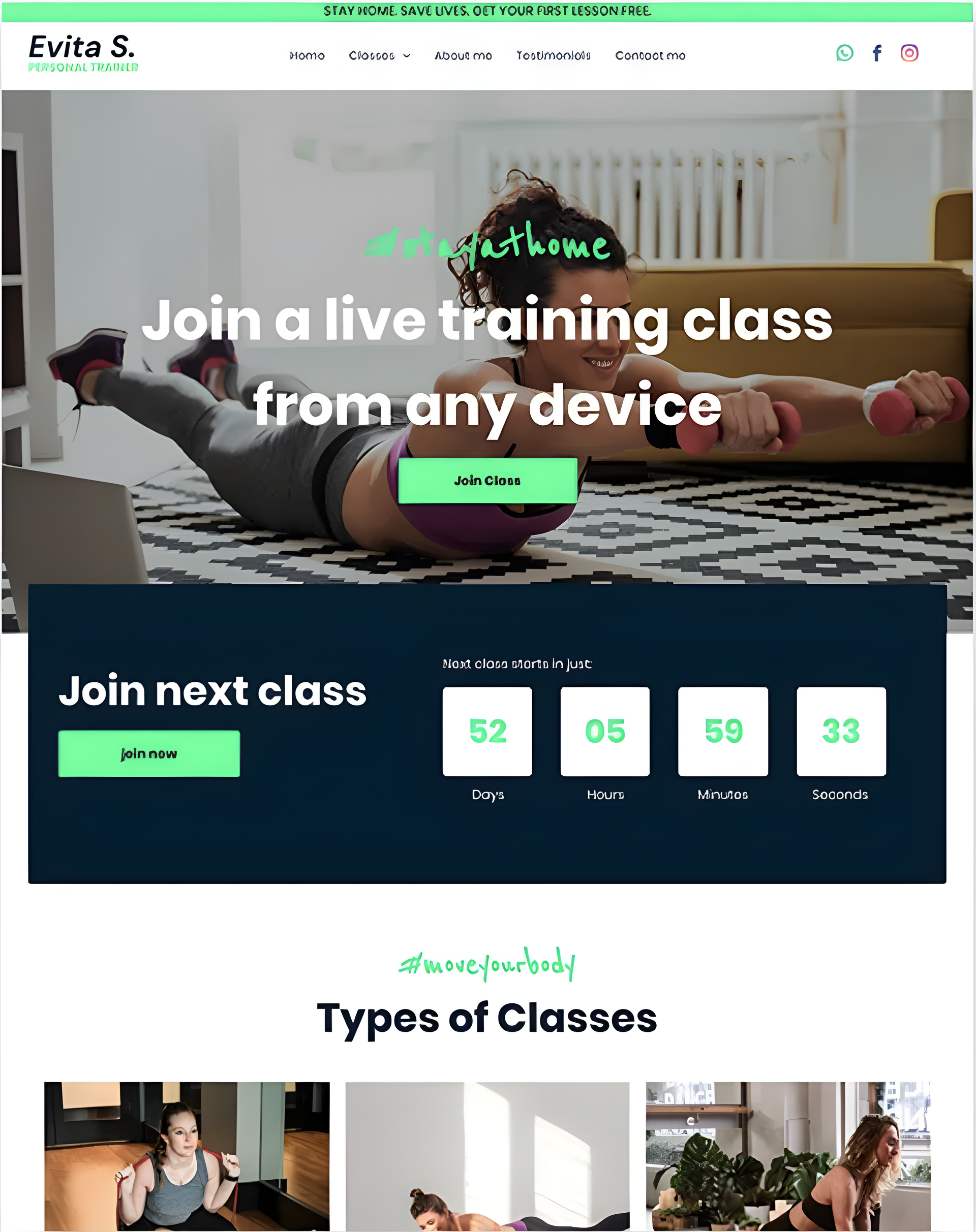
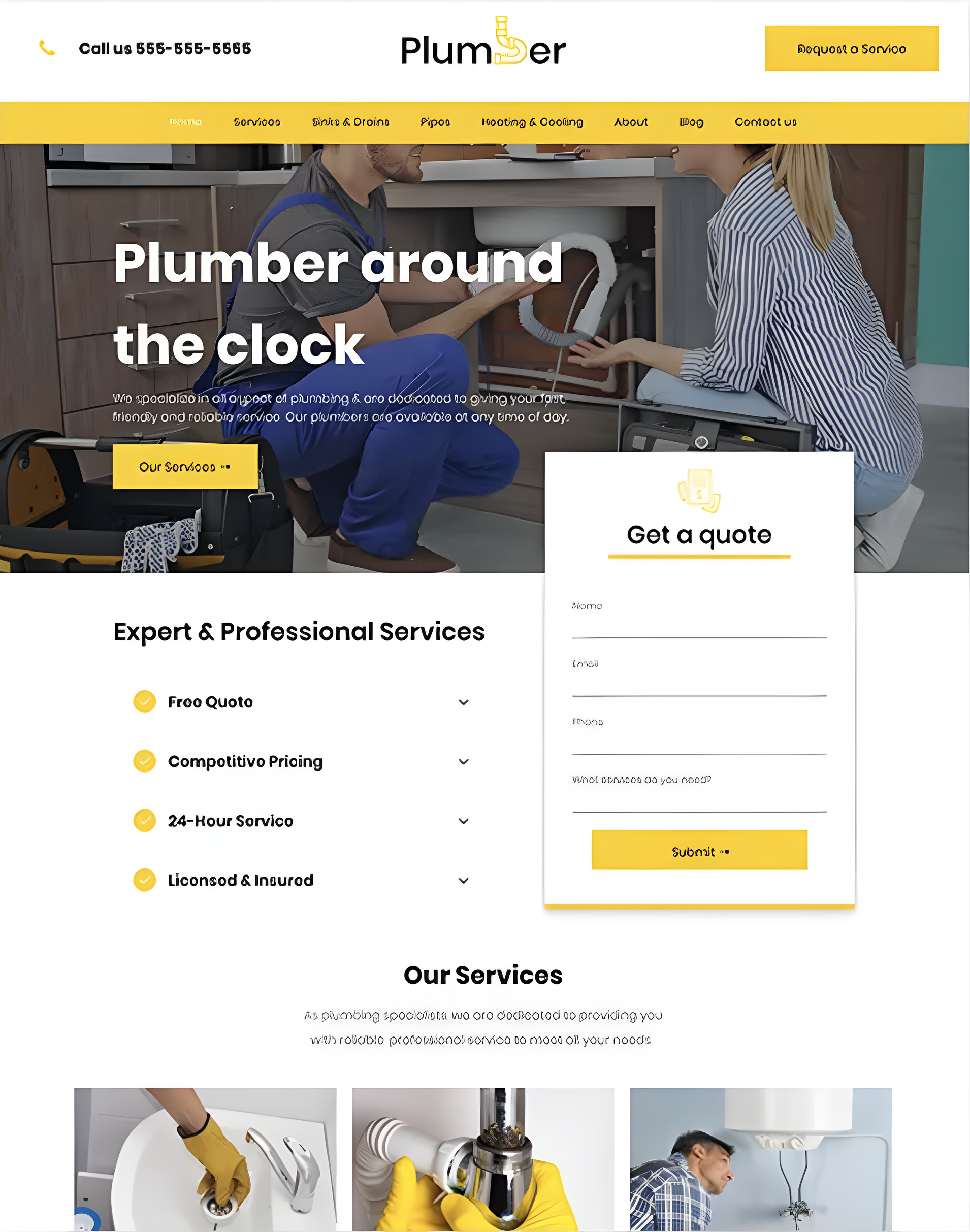
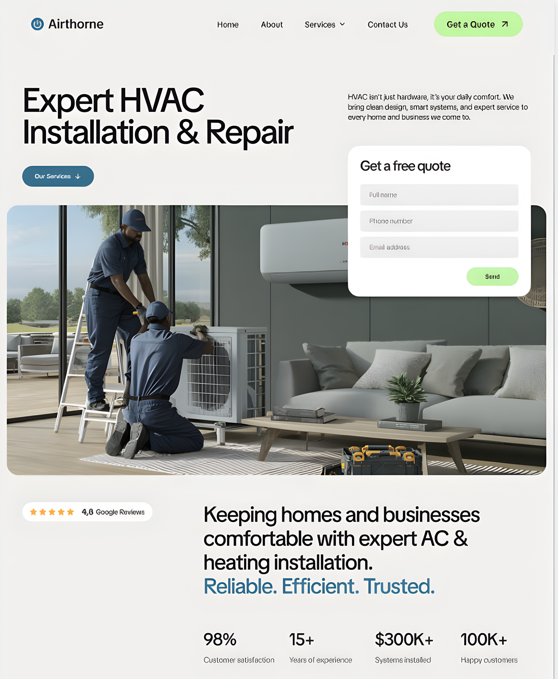
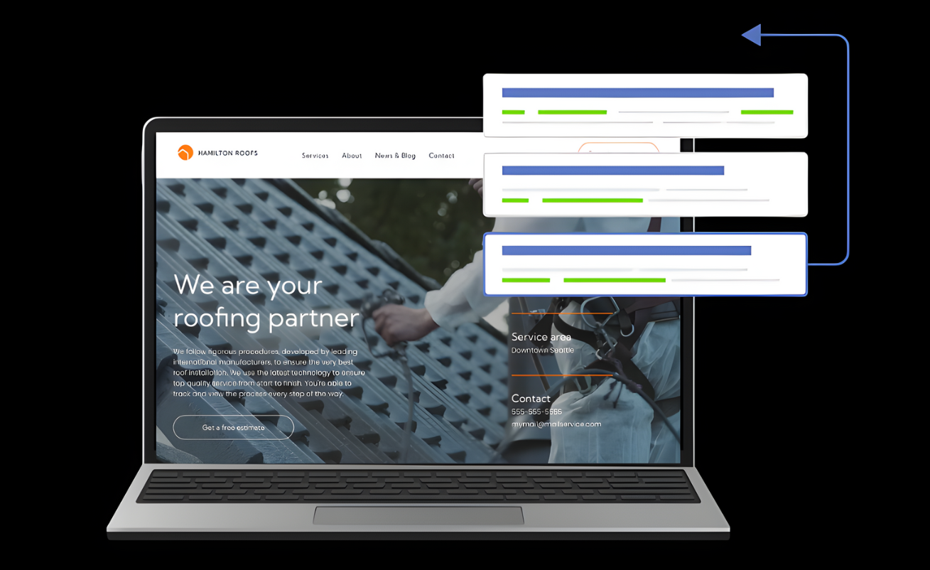
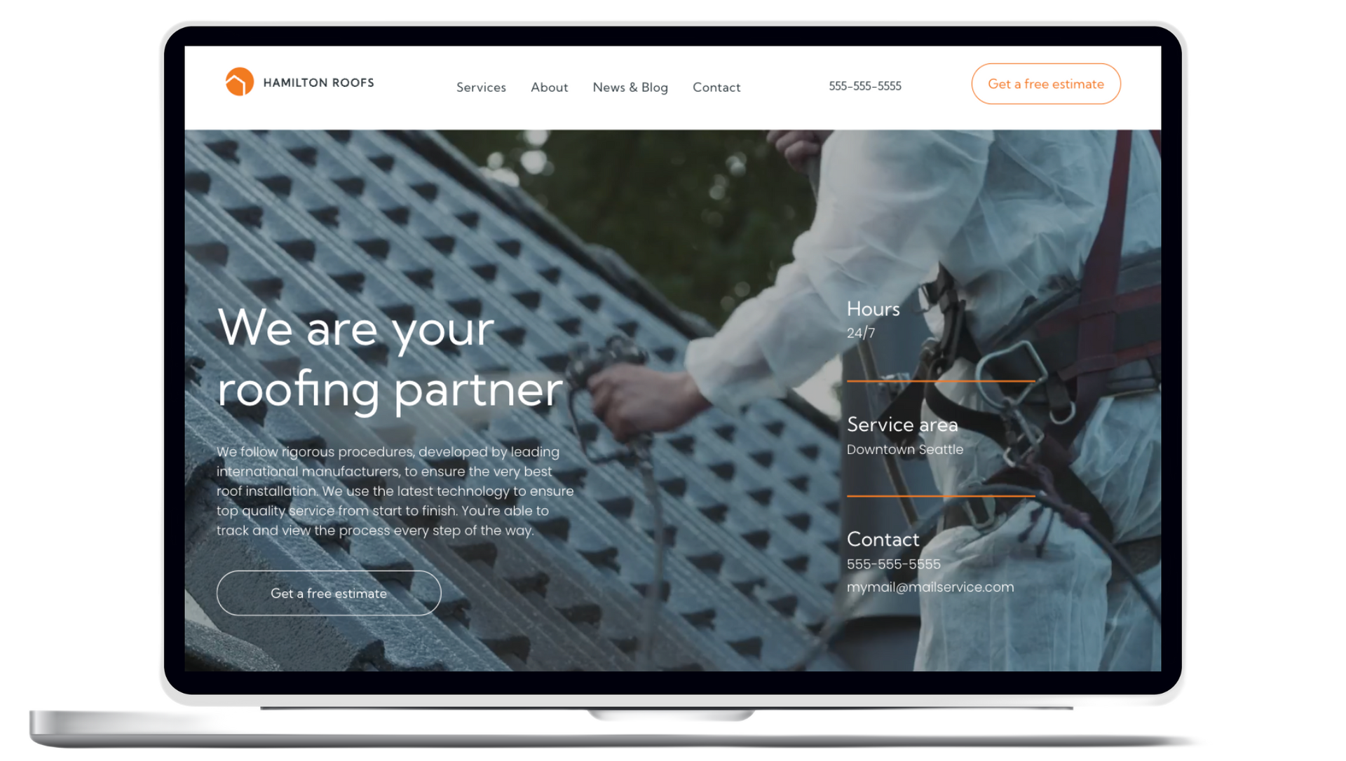
Web Design
Professional websites for small businesses in Melbourne
All of our websites are custom developed, SEO optimized with fast load speeds. Specifically for small businesses.


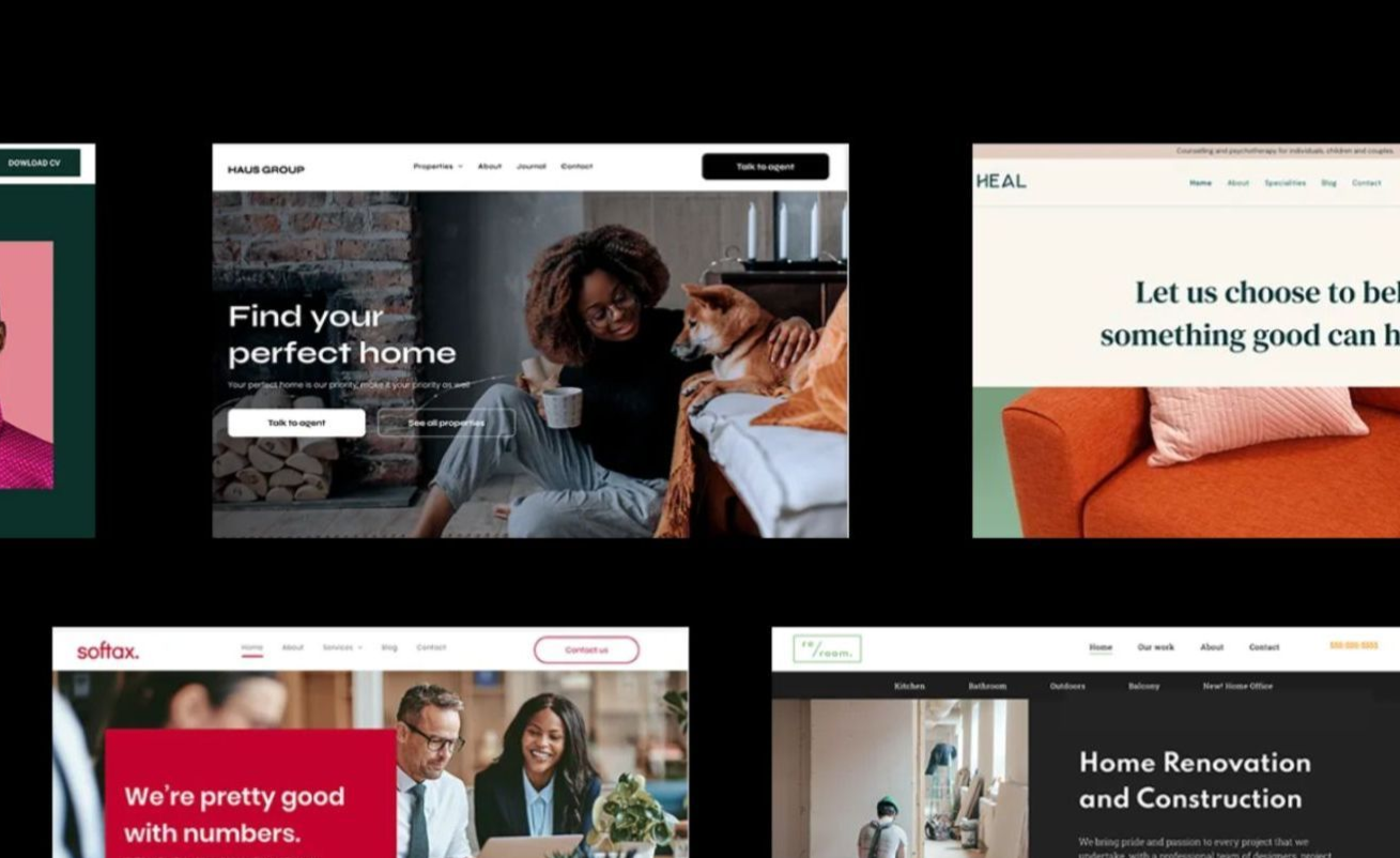
Services
How we help small businesses grow
We focus on the digital stuff that small businesses don't have time for so they can focus on what they're good at.


Web Design & Marketing Blog
Read our blogs to help you grow your online presence
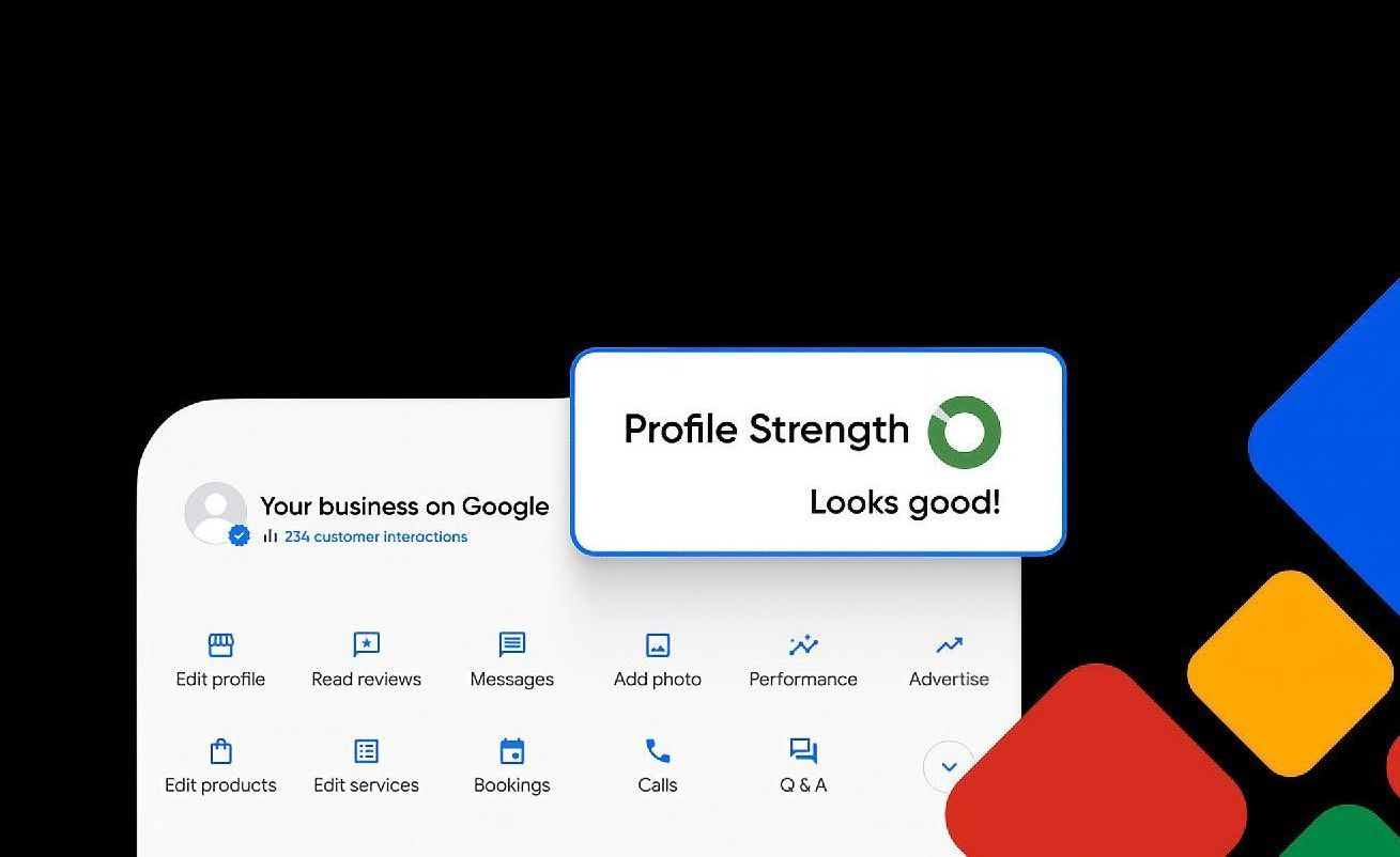
Research reveals that most mobile searches focus on location and often result in a store visit or purchase within 24 hours. This makes local business SEO a vital part of connecting businesses with customers in their area. Local SEO optimizes your business's online presence to showcase products or services to nearby customers through live search results. Local search engine optimization is different from traditional SEO because it targets people within your geographical area. Small business owners who implement a local SEO strategy see remarkable results. Their websites attract more qualified leads, build stronger brand recognition and convert more visitors from organic search results. This piece walks you through the basics of local SEO with tips to boost your business visibility in local searches. You'll learn everything from basic setup to community trust building. The best part? You won't need technical knowledge or a big budget to get started. What is Local SEO and why it matters Local business SEO connects you directly with people in your area who want to buy your products or services. Research shows that 80% of US consumers look up local businesses online every week. This makes local search one of the quickest ways to bring qualified customers to your business. How local SEO is different from traditional SEO The main difference between local SEO and traditional SEO comes down to who you're trying to reach. Traditional SEO helps you get noticed nationally or globally. Local SEO focuses on getting your business seen in your specific area - your neighborhood, town, or city. Traditional SEO targets broad keywords like "workout routines." Local SEO targets location-specific phrases like "workout gym in Chicago". This local focus gives small businesses a real edge. You compete with nearby businesses instead of large national corporations. Google knows certain terms are naturally local without extra words - like "coffee shop" or "pest control". Users who search these terms see nearby results based on where they are, even if they don't type "near me". Local SEO goes beyond just website optimization. It includes Google Business Profile management , online reviews, citation building, and creating local content. These elements work together to boost your visibility in both the map pack (the top three map results) and organic search results. Why local SEO is essential for small businesses Small businesses need local SEO not just to rank higher but to become trusted community members. Local searchers are ready to buy - they're not just browsing the internet. Local SEO offers these powerful benefits: Increased visibility and foot traffic - You show up right when customers need what you offer Higher conversion rates - Local searchers are more likely to make a purchase Economical solutions - You get lasting results without the ongoing costs of traditional ads like flyers or billboards Competitive advantage - Many local businesses haven't started using local SEO yet, which lets you capture more customers The numbers tell the story - 72% of consumers use Google to find local businesses. On top of that, more than half of shoppers prefer supporting local businesses or smaller brands. This makes local SEO perfect for connecting with community-focused customers. Local SEO helps small businesses compete with larger companies by focusing on their specific service areas. Setting up your local SEO foundation The foundation of strong local SEO rests on three essential elements that are the foundations of your entire local search strategy . Let me show you how each one works. Create and optimize your Google Business Profile Your Google Business Profile (formerly Google My Business) plays a vital role in local search success. A complete profile significantly boosts your chances of showing up in local search results. Research shows businesses with complete profiles are trusted 2.7 times more by customers on Google Search and Maps. These businesses also see 70% more visits and 50% higher purchase consideration. Here's how you can optimize your profile: Get your business verified through Google's process List your complete address (for customer visits) or service area Add your phone number, business category, and website URL Share high-quality photos of your business Set accurate operating hours, including holiday schedules Give quick responses to customer reviews Ensure consistent NAP (Name, Address, Phone) across platforms Your Name, Address, and Phone number (NAP) consistency is a vital part of local SEO success. Search engines trust businesses more when they find matching information across different websites. Accurate NAP information helps you: Build search engine trust signals Keep customers happy (52% leave bad reviews after finding wrong information) Improve local search rankings Your website should display NAP in text format (not images) in the header, footer, and contact page. Add your business to local directories Citations from reputable directories beyond Google help build legitimacy and visibility. In fact, these citations help determine local SEO rankings. Focus on these key directories: Bing Places for Business Apple Business Connect Facebook Business Page Yelp and industry-specific directories Local Chamber of Commerce websites Local directories might not have high domain authority, but they provide special value to businesses serving specific areas because of their regional relevance. Optimizing your website for local search Your website works as your digital storefront for local customers. Mobile devices now generate over 60% of searches, and many users look for local businesses. Your local SEO strategy must start with optimizing your site for local search. Use local keywords in titles and content Start with proper keyword research to find how people near you search for your products or services. Long-tail keywords with your location like "digital marketing services in Derby" work best. Put these local terms in your page titles, headings, meta descriptions, and content to boost your local visibility. Create location-specific landing pages Location pages connect with customers in areas you serve. These pages should showcase what makes each location special. Add specific details about each spot - operating hours, photos inside and out, deals, and customer reviews. This helps you attract local traffic and makes your customer's experience better. Add schema markup for local business Local business schema helps search engines understand your business details. This piece of technical SEO explains your content so search engines can read it better. Schema markup lets you show rich results in searches, which can display your contact info, reviews, and location right in the search results. Make your site mobile-friendly Local searches happen mostly on smartphones. Google gives priority to mobile-friendly websites , especially for local searches. Your site should load fast, use easy-to-read fonts, keep paragraphs short, and have clear menus. Businesses in competitive markets need a mobile-first approach to succeed in local search. Building trust and visibility in your community Building community trust plays a vital role in local business SEO success beyond technical optimizations. Your local presence can grow stronger with these three proven strategies. Encourage and respond to customer reviews Online reviews shape your local search rankings and consumer decisions. Research shows 91% of consumers trust online reviews as much as personal recommendations. Your review profile needs active management. The best time to request feedback comes right after positive customer interactions. Quick responses to negative reviews within a week demonstrate professionalism and care. Businesses that respond to reviews attract 77% more customers. Publish local content and blog posts Local content helps establish your business authority in your area. Your blog posts should cover local events, provide regionally relevant how-to guides, and highlight completed local projects. This targeted content attracts website visitors, creates new leads, and boosts local search visibility. Customer success stories and case studies build powerful social proof - 92% of consumers trust recommendations from people they know. Engage with local events and partnerships Community involvement demonstrates your credibility and local relevance. Your local SEO grows stronger through event sponsorships, non-competitive business collaborations, and support for local causes. Strategic collaborations create multiple community touchpoints that generate valuable backlinks, citation opportunities, and social media mentions. Conclusion Local business SEO provides a powerful way for small businesses to connect with customers who actively search for their products or services. This piece shows how focusing on your geographical area gives you an edge against larger corporations competing nationally. The good news is that local SEO strategies don't need technical expertise or a huge budget. A well-optimized Google Business Profile, consistent NAP information across platforms, and relevant directory listings create your foundation. These simple steps put your business ahead of many local competitors who ignore their online presence. Your website acts as a digital storefront for local customers. You need to optimize it with location-specific keywords, dedicated landing pages, and mobile-friendly design. Local business schema markup helps search engines understand and display your business information better in search results. Local SEO builds community trust naturally. Customer reviews, thoughtful responses to feedback, locally relevant content, and community event participation strengthen your business's reputation. These actions improve your search rankings and create meaningful connections with the people you serve. Local SEO benefits go nowhere near just appearing in search results. Yes, it is true that better visibility guides more foot traffic, higher conversion rates, and affordable marketing that delivers lasting results. Small businesses looking to grow their customer base will find local SEO a direct path to nearby customers ready to make a purchase. Start with the fundamentals outlined here. Once you establish your foundation, implement more advanced local SEO tactics gradually. The digital world evolves constantly, but serving your local community with valuable information and genuine participation remains unchanged. Your steadfast dedication to local SEO will help your business thrive online and in your community for years to come. Key Takeaways Local SEO is your gateway to connecting with nearby customers who are actively searching for your products or services. Here are the essential strategies every small business owner needs to implement: • Claim and optimize your Google Business Profile - Complete profiles make customers 2.7x more likely to consider your business reputable and 70% more likely to visit your location. • Maintain consistent NAP information everywhere - Keep your Name, Address, and Phone number identical across all online platforms to build search engine trust and avoid customer confusion. • Target location-specific keywords - Focus on phrases like "digital marketing services in Derby" rather than broad terms to compete effectively against local businesses, not global corporations. • Make your website mobile-friendly - With 60% of searches happening on mobile devices, a responsive site is essential for capturing local traffic and improving search rankings. • Actively manage customer reviews - Encourage feedback after positive interactions and respond to all reviews within a week, as 77% of customers prefer businesses that engage with reviews. Local SEO levels the playing field for small businesses, allowing you to compete effectively by focusing on your geographic area rather than battling large corporations nationally. Start with these fundamentals and watch your local visibility grow. FAQs Q1. How can I improve my local SEO in 2026? To improve your local SEO, start by optimizing your Google Business Profile, ensuring consistent NAP (Name, Address, Phone) information across platforms, and targeting location-specific keywords. Create mobile-friendly website content, encourage customer reviews, and engage in local community events to boost your visibility in local search results. Q2. What are the key components of a successful local SEO strategy? A successful local SEO strategy includes optimizing your Google Business Profile, maintaining consistent business information across online platforms, creating location-specific website content, implementing schema markup, encouraging and responding to customer reviews, and engaging with your local community through events and partnerships. Q3. How important are customer reviews for local SEO? Customer reviews are crucial for local SEO. They significantly impact your local search rankings and consumer decisions, with 91% of consumers trusting online reviews as much as personal recommendations. Actively encourage reviews after positive interactions and respond promptly to all feedback to improve your local visibility and reputation. Q4. Why is mobile optimization essential for local SEO? Mobile optimization is vital for local SEO because over 60% of searches now come from mobile devices, many of which are local queries. Google prioritizes mobile-friendly websites, especially for local searches. Ensuring your site is responsive, loads quickly, and is easy to navigate on smartphones can significantly improve your local search performance. Q5. How can small businesses compete with larger corporations in local search results? Small businesses can effectively compete with larger corporations in local search by focusing on their specific geographic area. This includes using location-specific keywords, creating content relevant to the local community, maintaining an optimized Google Business Profile, and actively engaging in local events and partnerships. These strategies allow small businesses to capture local market share more effectively than broad national campaigns.
I never thought about creating an ecommerce guide until I saw online shopping explode right before my eyes. The global ecommerce market hit $6.7 trillion in 2025 and experts project it to reach nearly $8 trillion by 2027. More than 2 billion people worldwide shop online regularly, and this was a chance I couldn't overlook. My journey began with one ecommerce business that grew into three thriving stores. The digital world seemed daunting at first, but I found that building an ecommerce store doesn't need complex technical skills or huge investments. My path had its share of setbacks and wins, yet I learned that starting an ecommerce business follows clear patterns. This piece contains everything I wish someone had told me about ecommerce - from picking products to growing operations. The steps, tools, and strategies in this guide powered my success in a market where third-party sellers now make up over 50% of all online store sales. You'll get practical advice based on ground experience that works for both new store launches and business expansions. Choosing the Right Product for Your Ecommerce Store Product selection became my make-or-break moment in the ecommerce world. My experience with three stores taught me that picking the right products isn't about guesswork – you need research to prove it right. How I picked my first winning product My first soaring win came when I spotted a real problem people faced daily. Rather than following trends, I searched for items that fixed specific pain points. Market research backs this up: products that solve real problems sell by a lot better than decorative items. Reading reviews of competing products became my starting point. The negative comments showed me exactly what to build. The sort of thing I love happened when I found hundreds of complaints about flimsy kitchen gadgets that broke easily. This gave me the chance to build something tougher while keeping prices attractive. These three criteria helped me succeed: Problem-solving ability : Does it make life easier or more enjoyable? Just need : Are people searching for solutions? Profit potential : Could I sell it at 3-4x my total cost? This approach led me to a kitchen organization product that became my first bestseller. The numbers worked great with 200% markup after costs, which left room to market and grow the business. Lessons from choosing the wrong niche My biggest mistake? I picked a product based only on profit potential without thinking over my interests or market demand. My second store launch jumped into a trending niche without proper confirmation – many entrepreneurs fall into this trap. To name just one example, I opened a store selling specialty phone accessories when the market was already packed. My research showed profits looked good, but I missed how 85% of new sellers struggled to stand out. Money went down the drain when I ignored product lifecycle too. Research covering 83,719 consumer goods launches revealed that 25% disappeared from shelves within a year, and 40% vanished after two years. These numbers now guide how I pick products – I look for lasting value instead of quick trends. My target audience research needed to be better. Products often fail because sellers don't understand their customers' priorities. My poor niche choice flopped because the products didn't match what my audience wanted. Validating product ideas with real data My ecommerce experience changed after I started using strict validation. As one founder says, "Money is the only thing that can validate a product". Small batch testing now comes before any big commitments. Google Trends became my first stop to check demand. This budget-friendly tool showed whether interest in potential products grew, stayed steady, or dropped. Keyword research helped me find search volume and competition levels. The third store started with a simple landing page showing my product's value and an email signup box. This basic setup let me test real interest before buying inventory. Email signups became my success measure – I wanted 10-20% of visitors to subscribe. Validation helps you find demand cheaply, change direction early if numbers look weak, and save both money and motivation. Most ventures don't get second chances, so getting it right the first time really matters. Selling through dropshipping before stocking inventory worked best for validation. This let me test actual customer demand without spending much upfront. Once those original sales confirmed the idea worked, I invested in proper inventory and branding. Planning Your Ecommerce Business the Smart Way I found that proper planning was the foundation of my ecommerce success after picking the right products for my stores. A goal without a plan is just a wish. Building three successful stores taught me that good planning makes the difference between struggling and thriving. Why a simple business plan matters My first ecommerce venture failed because I didn't have a proper plan. It led to wasted resources and missed opportunities. Everything changed when I created a simple business plan . This roadmap helped me focus on revenue and sales and provided clear direction for making decisions. A business plan does more than secure funding. It guides you to identify and manage risks, define clear objectives, and map out ways to achieve your goals. You'll think through everything in your business before investing time and money. The business planning process showed me different factors affecting my success. I could step back and look at what worked and what needed improvement. Regular reviews and updates of my business plan kept my ecommerce stores on track as market conditions changed. My simple business plans had these key components: Market analysis and target customer profiles Clear business objectives and strategies Financial projections and resource requirements Marketing and sales approach Setting realistic goals for your first year Setting unrealistic expectations was a major mistake with my first store. Research shows people with specific, challenging goals consistently outperform those with vague or no goals. These goals must be achievable. Small ecommerce brands typically see traffic grow by 5-10% monthly, conversion rates around 2-3%, and returning customer rates near 30%. These measures proved accurate in my experience. The SMART framework—Specific, Measurable, Achievable, Relevant, and Time-bound—helped me create goals that drove results. Breaking larger ambitions into smaller milestones made progress easier to manage and helped me stay motivated during tough times. My first year focused on survival rather than rapid growth. My main goals were staying profitable, keeping consistency, and building solid foundations. This realistic approach saved me from the burnout that many ecommerce entrepreneurs face when chasing quick success. Understanding your target audience Here's the most valuable lesson from all three of my stores: knowing your target audience forms the core of ecommerce success. Your target audience has specific people most likely to want your product or service—they become your customers. My early mistake was trying to sell to everyone. This made focusing marketing efforts really hard. My conversion rates improved dramatically after I defined my target market through demographic information (age, gender, location, income), psychographic data (interests, values), and behavioral patterns (buying habits). Knowing my target audience helped me: Market smarter by investing in effective campaigns and cutting unsuccessful ones Develop products that addressed specific customer needs Increase revenue by focusing on segments generating the highest returns I analyzed existing customer profiles, researched competitors, and ran surveys to gather firsthand data to identify my target market. Creating detailed buyer personas with specific traits helped me visualize ideal customers and shape marketing efforts to their needs. Good planning and audience research transformed my ecommerce ventures from struggling experiments into profitable, sustainable businesses. Every business decision I made later built on this foundation. Building Your Online Store from Scratch Building my online business infrastructure was both thrilling and daunting. A successful ecommerce store needs three vital elements: the right platform, design that converts, and tools that make launching easier. Choosing the right ecommerce platform My first big tech decision was picking an ecommerce platform. I needed something that worked well, didn't cost too much, and was easy to use. After testing several options, I found that platforms vary greatly in what they offer. SaaS (Software-as-a-Service) platforms like Shopify gave me the quickest path to market. These platforms took care of hosting, security updates, and payment processing - technical headaches I wasn't ready to handle. The drag-and-drop store builder let me create a professional site without knowing how to code. My first store needed these platform features: Payment gateway compatibility Shipping integration capabilities Inventory tracking functionality Mobile responsiveness Scalability for future growth The total cost became a vital factor in my choice. Some platforms advertised lower monthly fees but charged extra transaction fees or needed expensive add-ons for basic features. Shopify has unlimited bandwidth and product listings in every plan, which helped me avoid surprise costs as my traffic grew. Designing a store that converts After choosing my platform, I focused on building a store that converts well. Research showed that more than half of Australians quit their purchases because checkouts were slow or complicated. This fact shaped how I designed my store. First impressions can make or break a sale. A landing page must show value right away and answer one question: "What's in it for me?". This meant using clear headlines, quality product images, and compelling copy that guided visitors toward buying. My conversion-focused design included: Simplified navigation : Clean menu structure with intuitive categories Mobile-first design : Perfect function on smartphones, since over 70% of ecommerce traffic comes from mobile devices Clear calls-to-action : Direct language like "Add to Cart" or "Shop Now" to guide users Optimized checkout : Fewer steps, guest checkout option, and multiple payment methods Trust elements : Badges for security, return policies, and shipping information My goal was to remove friction by improving usability, making messages clear, and reducing steps to conversion. Essential tools I used to launch quickly The right tools helped speed up my store launch and boost performance. These tools became must-haves for running different parts of my business: Analytics tools gave me key insights into how visitors behaved. I set up Shopify Analytics and Google Analytics immediately to see how users moved through my site, spot problem areas, and make informed improvements. The platform's built-in inventory system helped me track stock immediately, automatically marked items as "Sold Out," and told me when to reorder. Email marketing software helped me recover abandoned carts and build customer relationships. This tool was a great way to get early success by bringing back uncertain shoppers. A product search bar with auto-suggestions improved the experience for visitors who knew what they wanted. My online store needed both technical and user experience considerations. The right platform, conversion-focused design, and essential tools created an ecommerce foundation that accelerated growth instead of holding it back. Marketing That Actually Works for Small Stores My e-commerce business stayed invisible despite having great products and a well-laid-out store. I needed to become skilled at effective marketing first. The path wasn't easy, and I made plenty of mistakes. What didn't work: my early marketing mistakes My biggest marketing mistake at the start was trying to sell to everyone. My brand's unique qualities got lost because I tried to appeal to the broadest possible audience. This failed to create meaningful connections with anyone. You often end up with no customers when you try to appeal to everyone. I threw away valuable resources on marketing channels that didn't work. The analytics data was there, but I didn't track which platforms brought in sales. My scattered efforts brought minimal results. Using generic manufacturer product descriptions in my store was a costly mistake. This hurt my SEO because I competed with hundreds of vendors using similar content. It also failed to distinguish my brand. Search rankings improved right after I rewrote the product descriptions with original content. Mobile optimization was another critical oversight, especially since 79% of smartphone users bought something online in early 2021. People quickly left my site when they ran into display issues on their phones. How I got my first 100 customers My results improved once I spotted these mistakes and started using a targeted approach. The breakthrough came when I realized my first customers weren't just sales numbers - they showed people believed in what I offered. My existing network became my starting point. Friends and family provided initial sales and great feedback about products, pricing, and store appearance. Their input helped me improve before expanding. Social media profiles became essential tools. My business looked more reliable and trustworthy after I secured consistent usernames across platforms and filled out all profile information. This simple change substantially increased conversion rates. These strategies helped me grow beyond my network: Created limited-time promotions to create urgency and encourage quick action Joined communities where my ideal customers already gathered (LinkedIn groups, Reddit, Slack channels) Offered value before selling by answering questions and sharing insights in online spaces The best strategy focused on people actively searching for solutions like mine. One founder said it perfectly: "your first customers are already looking for a solution like yours". This targeted approach validated my business idea faster than broad marketing efforts. Using email and social media effectively Social media marketing became my most affordable tool to build brand awareness. I connected with new audiences and drove e-commerce sales without a big budget. Consistency proved more important than being everywhere. Many small businesses try to do too much across multiple platforms. I chose to focus on one or two channels my customers used most. This focused approach worked better than spreading efforts thin. Email marketing brought the highest returns by creating direct customer connections. Building my email list became a priority from day one. Unlike "rented" social media audiences, my email list became an owned asset. Email turned into my conversion engine through tailored campaigns, exclusive offers, and timely reminders. Automated sequences worked exceptionally well. Welcome emails saw 91.43% open rates, and abandoned cart reminders recovered 10-20% of lost revenue. These simplified processes kept my brand active around the clock without overwhelming my team. My small e-commerce store's marketing success didn't come from outspending competitors. Strategic focus, genuine connections, and using the right tools at the right time made all the difference. Shipping, Fulfillment, and Customer Experience Marketing success is important, but I found that there was one truth in ecommerce: shipping and fulfillment make or break the business. Research shows that quick, efficient delivery drives customer satisfaction and repeat business. How I handled shipping with limited resources My small business faced big challenges with shipping due to budget constraints. Product packaging became my primary focus to protect items and cut costs. This strategy helped me optimize space and save money. Everything changed when I automated my shipping workflows. My ecommerce platform connected directly to the shipping provider, which let me create labels, schedule pickups, and track deliveries from one dashboard. The system reduced errors, sped up fulfillment, and saved precious time. My first store offered various shipping speeds with clear delivery timelines. Customers loved having choices, which became our competitive edge. The estimated delivery dates and free shipping thresholds boosted our conversion rates. Creating a smooth post-purchase experience The post-purchase experience proved significant in building customer loyalty. Our system kicked in right after checkout with these touchpoints: Detailed order confirmations with tracking links Shipping notifications and delivery updates Post-delivery follow-ups requesting feedback Research backs this approach - 90% of consumers value the post-purchase experience as much as product quality. Note that post-purchase communication must be proactive. Up-to-the-minute tracking updates reduced "where's my order?" questions dramatically. We moved from reacting to customer concerns to preventing them entirely. Thoughtful packaging made the unboxing experience special. The investment protected items during transit and enhanced customer experience. These small details brought great returns through customer satisfaction and repeat business. Returns, refunds, and building trust A solid returns process became our secret weapon for building trust. The numbers tell the story - 84% of consumers say returns experience shapes their opinion of retailers by a lot. About 95% are less likely to shop again after a poor returns experience. Our site featured a clear returns policy that spelled out timeframes and conditions. This strategy made sense since 96% of online shoppers check return policies before buying. Returns aren't just a cost of doing business - they're opportunities for retention. Easy exchanges often kept revenue that might have been lost. Each smooth returns experience strengthened customer relationships and increased their lifetime value. Scaling Up: From One Store to Three Scaling from one successful ecommerce store to three needed perfect timing and smart decisions. My ecommerce business changed after this growth experience. I learned valuable lessons along the way. The right time to launch your second store The perfect moment to expand makes all the difference. My second store opened only after my first one showed steady revenue growth and healthy profit margins. Yes, it is better to wait until your main store shows signs it needs to scale. My store had frequent stockouts and an overwhelmed support team - clear signs that told me it was time. Before expanding, I asked myself some hard questions. Could I handle bigger challenges? Would I have enough time without neglecting other aspects of my life? Did I have enough money?. These questions helped me avoid rushing into growth that could have led to unpaid bills or unfulfilled orders. Automating tasks to save time Automation became my edge in running multiple stores at once. My focus stayed on these vital areas: Order processing workflows that cut down manual work and mistakes Inventory management that reordered stock at set levels Customer support with self-service return portals and FAQ systems This approach worked wonders - 90% of AI automation users say it helps them focus on work that matters most. The automated tasks let me grow without rushing to hire new people, which helped during talent shortages. Hiring help vs. doing it all yourself I had to choose between hiring staff, outsourcing, or running everything myself. My second store worked best with outsourced non-core tasks while I kept control of strategic decisions. This plan succeeded because outsourcing routine work improved efficiency without breaking the bank. My third store needed a different approach. I hired people in areas that would give the best returns - marketing was my priority. The team got clear documentation about our processes before they started, which kept things consistent across all stores. In-house staff brought clear benefits: they knew the brand better, worked faster than contractors, and kept operations more consistent. A mix of automation, outsourcing, and smart hiring helped me grow to three successful stores. Conclusion My experience building three successful ecommerce stores taught me something interesting - success follows patterns rather than random luck. During my trip, I learned that products solving real problems work better than chasing trends. The process of proving it right with real data became the life-blood of my approach. A simple business plan changed everything for my ecommerce ventures. This roadmap helped me stay focused and gave me clear direction for vital decisions. My marketing transformed from scattered efforts to strategic campaigns once I understood my target audience. These campaigns connected with potential customers in a genuine way. Setting up an online store seemed scary at first. The right platform choice, conversion-focused design, and proper tools made everything manageable even without technical know-how. Marketing became my next big hurdle after the store setup. I made rookie mistakes like trying to sell to everyone. Success came later through targeted approaches and steady work on specific channels. Shipping and fulfillment turned out to be just as important as marketing. Quick delivery and thoughtful follow-up communication affected customer satisfaction and repeat business by a lot. A clear returns policy built trust and turned potential losses into chances to keep customers. The move from one store to three needed perfect timing and smart automation. I waited for my first store to show steady growth before expanding. This saved me from scaling too soon. Finding the sweet spot between automation, outsourcing, and smart hiring let me grow multiple stores successfully. The ever-changing world of ecommerce keeps moving faster, but these basics stay the same. You don't need technical skills or huge money to start an online store. Good planning, customer focus, and learning from mistakes will do. These proven strategies will boost your chances of success whether you're starting fresh or growing your business. Key Takeaways Here are the essential insights from building three successful ecommerce stores that can guide your own online business journey: • Validate before you invest : Test product demand through small batches, landing pages, or dropshipping before committing to inventory - money is the only true validation. • Focus beats breadth in marketing : Target specific customer segments rather than trying to appeal to everyone; concentrated efforts on 1-2 channels outperform scattered approaches. • Automate early to scale smart : Implement automated workflows for order processing, inventory management, and customer support to manage multiple stores without immediate team expansion. • Post-purchase experience drives loyalty : 90% of consumers value post-purchase experience as much as product quality - invest in shipping notifications, tracking, and transparent return policies. • Plan for profit, not just revenue : Set realistic first-year goals focusing on survival and sustainability rather than dramatic scaling; healthy growth means 5-10% monthly traffic increases. The path to ecommerce success isn't about technical expertise or massive capital - it's about solving real problems for specific customers, validating ideas with data, and building systems that scale efficiently. These fundamentals remain constant even as the ecommerce landscape continues evolving. FAQs Q1. How do I choose the right product for my ecommerce store? Focus on products that solve real problems, have market demand, and offer good profit potential. Validate your ideas through small-scale testing, such as creating landing pages or using dropshipping, before investing in inventory. Q2. What's the most effective way to market a small ecommerce store? Concentrate your efforts on one or two channels where your target audience is most active. Personalized email marketing and strategic social media engagement often yield the best results for small stores. Q3. How important is the post-purchase experience in ecommerce? The post-purchase experience is crucial. Implement clear order confirmations, shipping notifications, and follow-ups. A smooth returns process can significantly impact customer satisfaction and loyalty. Q4. When should I consider expanding from one ecommerce store to multiple? Wait until your first store shows consistent revenue growth and healthy profit margins. Ensure you have the capacity to manage additional strategic challenges and sufficient financial resources before expanding. Q5. What role does automation play in scaling an ecommerce business? Automation is key to efficient scaling. Prioritize automating order processing, inventory management, and customer support tasks. This approach can help you manage multiple stores without immediately needing to expand your team.
Website speed optimization directly impacts your bottom line. Research from skilled.co shows that 47% of customers expect a webpage to load in 2 seconds or less. Missing this target can get pricey quickly. The numbers tell a compelling story about loading time and conversion rates. Sites loading in 2.4 seconds see a 1.9% conversion rate. This number drops to nowhere near 1% when load times reach 4.2 seconds. A tiny 0.1-second improvement can boost conversions by 10.1% for travel websites and 8.4% for eCommerce platforms. Load delays of 4 seconds cause bounce rates to spike above 24%. Your potential customers will likely head straight to your competitors. Money talks. Walmart's data proves it - every second saved in loading time increased conversions by 2%. Picture this: an eCommerce site with $10 million in yearly sales could gain $200,000 in revenue just by shaving off a single second. This piece will show you affordable website speed optimization techniques and tools that can reshape your site's performance and stop slow loading times from eating into your sales. How slow website speed affects user behavior Slow websites do more than just annoy users—they chase them away. Data clearly shows how speed affects user behavior on all devices and situations. Users expect pages to load in under 3 seconds Users won't wait longer than 3 seconds for a page to load. Research reveals that 47% of consumers want websites to load in 2 seconds or less. This leaves very little room to engage visitors, as 40% of them leave websites that take over 3 seconds to load. Missing this mark comes at a heavy cost. Bounce rates shoot up after 3 seconds. The chance of users leaving increases by 32% when load times go from 1 to 3 seconds. These numbers get worse quickly—90% at 5 seconds and a whopping 123% at 10 seconds. Each extra second of delay cuts customer satisfaction by 16%. Users spot slowness right away, and after 10 seconds, they lose focus completely. At this point, there's almost no way to get their attention back. Mobile users are more likely to bounce Mobile users have even less patience with slow sites. While desktop users might stick around briefly, 53% of mobile visitors abandon sites that take over 3 seconds to load. This creates real problems since mobile traffic now makes up over half of all web visits. Three out of four mobile users say they leave websites because they're too slow. Mobile users often deal with poor connections, which makes them very sensitive to speed issues. Sites that load faster on mobile see up to 50% better chances of visitors completing purchases. First impressions are formed in milliseconds The most striking fact is how quickly users judge your website. Studies show people decide if they like a web page's look in just 50 milliseconds—that's 1/20th of a second. This original impression deeply affects brand perception. About 79% of consumers who spot poor website performance say they won't come back. Users subconsciously link slow websites with outdated technology and unprofessional companies. Your website's speed works like a firm handshake—it sets expectations for everything that follows. A quick-loading site builds trust and makes people want to explore, while delays suggest incompetence and send potential customers to your competitors. The data: How speed impacts website conversion rates The numbers tell a clear story about how website speed affects your bottom line. Real data shows exactly how loading times can make or break your business outcomes. 1-second delay can reduce conversions by 7% The data shows that just one second of delay cuts your conversion rate by 7%. A business making $500 per day loses almost $13,000 yearly because of this delay. This small technical hiccup hits your profits hard. The Aberdeen Group's research backs this up, showing both the 7% drop in conversions and a 16% dip in customer satisfaction. Case study: Walmart's 2% gain per second improvement Walmart's story proves how speed drives sales. They learned they weren't as fast as Amazon and eBay, so they rebuilt their site's performance. The results spoke for themselves. Each second they shaved off loading time boosted conversions by 2%. On top of that, every 100ms improvement added up to 1% more revenue. These gains pushed Walmart to cut their checkout bundle code in half, which sent their performance and sales through the roof. Case study: Rakuten's 33% increase in conversions Japanese e-commerce powerhouse Rakuten saw even better results from their speed upgrades. Their focus on Core Web Vitals led Rakuten 24's conversion rate to jump by 33.13%. Their numbers showed that good Largest Contentful Paint (LCP) scores alone could boost conversions up to 61.13%. The company's approach paid off big time with a 53.37% increase in revenue per visitor and 35.12% fewer exits. Bounce rate spikes after 3 seconds Users bail out faster when pages take more than 3 seconds to load. Bounce rates go up by 32% as load times climb from 1 to 3 seconds. This number shoots up to 90% at 5 seconds and hits 123% at 10 seconds. Pages that load in 2.4 seconds see about 1.9% conversion rate, but this drops under 1% at 4.2 seconds. Impact on average order value and revenue per visitor Loading speed changes how much people spend too. Rakuten's improvements boosted their average order value by 15.20%, while other studies show e-commerce sites seeing a 9.2% increase. Mobile sites that load in one second make 2.5 times more money per user than five-second sites. This explains why slow websites cost retailers about $3.98 billion each year. Key metrics and tools for website speed optimization Website speed optimization starts with measuring the right metrics and understanding what the data means. The right combination of metrics and tools will help you make meaningful improvements instead of wasting time on ineffective changes. Understanding Core Web Vitals: LCP, INP, CLS Google's official metrics for measuring user experience are called Core Web Vitals. Largest Contentful Paint (LCP) measures loading performance, with good scores under 2.5 seconds. Interaction to Next Paint (INP) shows how responsive your site is, with a target of less than 200 milliseconds. Cumulative Layout Shift (CLS) tracks visual stability, aiming for scores below 0.1. These metrics use the 75th percentile as their benchmark, which means 75% of your users should experience these thresholds or better. Why lab data isn't enough: field data matters Lab data comes from controlled environments with predefined settings, while field data shows how real users experience your site on devices and networks of all types. Lab testing gives consistent standards, but it can't capture the wide range of actual user conditions. Field data shows the real performance distribution—revealing how some users get lightning-fast loads while others deal with slow loading times. Prioritizing improvements based on field data helps you fix real user problems rather than theoretical issues. Tools to measure speed: PageSpeed Insights, GTmetrix, Lighthouse PageSpeed Insights combines lab diagnostics with field data from real Chrome users. GTmetrix gives complete reports with waterfall charts, video recordings, and historical trends. These tools work differently—PageSpeed uses "simulated throttling" while GTmetrix loads pages in real-time under specified conditions. This fundamental difference explains why the same page often gets different scores across tools. You'll get the best results by combining these insights with Lighthouse audits, which review performance along with accessibility and best practices. Proven website speed optimization techniques Let's look at some proven ways to make your website faster now that we know why speed matters. 1. Implement caching (server-side and browser) Your website can store temporary file copies through caching, which helps returning visitors load pages faster. Users' devices keep resources through browser caching, and server-side caching cuts down database queries. You should set up HTTP caching with Cache-Control headers that use "max-age" for static content and "no-cache" for dynamic content. Static files need long expiration times (31536000 seconds or one year) with the "immutable" attribute to stop unnecessary revalidation requests. 2. Optimize and compress images Most webpage data comes from images. You can shrink them using lossy formats like JPEG and WebP, cutting file sizes by up to 10:1 without losing much quality. JPEG works best for photos, PNG for graphics needing transparency, and GIF for animations. Your pages will seem faster if you use progressive rendering. 3. Use lazy loading for media Lazy loading makes your pages wait to load off-screen images and videos until users scroll near them. This approach really helps since image sizes grew from ~250KB to ~900KB on desktop between 2011-2019. The simple HTML attribute makes lazy loading work. Users benefit from fewer network requests, faster initial loads, and saved bandwidth. 4. Minify CSS, HTML, and JavaScript Code minification strips out extra characters like whitespace, comments, and line breaks while keeping functionality intact. Files can shrink by 20-50% or more. CSS Minifier, JSCompress, and HTMLMinifier make this task easy. Bigger projects should use build tools like Webpack, Gulp, or Terser to automate minification for every deployment. 5. Use a Content Delivery Network (CDN) CDNs put your content on servers worldwide and serve it from locations closest to users. Pages load up to 50% faster with less latency. CDNs do more than speed things up - they make sites more reliable through redundancy, lower bandwidth costs with cached content, and guard against DDoS attacks by handling traffic spikes. 6. Preload critical content Browsers can grab important resources early when you tell them what to preload, before they'd normally find them during parsing. Critical assets like hero images and fonts needin your HTML head. This works great for resources that browsers would find late otherwise, such as fonts in CSS files or critical JavaScript. Just don't preload too much - stick to 3-4 resources to keep browsers running smoothly. 7. Subset and optimize fonts Font files often carry unused glyphs that add unnecessary weight. You can dramatically cut font sizes through subsetting - some drop from 139KB to just 15KB. WOFF2 format compresses 30% better than WOFF. Websites serving multiple languages should use unicode-range to deliver just the needed character sets. 8. Remove unnecessary third-party plugins Unused plugins waste resources and might create security holes. Even inactive plugins can slow things down by bloating your database. You should check your plugins regularly and remove the ones you don't use. The cleanup should include deleting associated database rows to prevent orphaned data from dragging down your site's performance. Conclusion Website speed is one of the most important factors that affect your online business success. This piece shows how small delays can drastically affect user behavior and your revenue. The numbers tell the story—conversions drop by 7% with just a one-second delay, and bounce rates double after just 4 seconds. These statistics matter because they represent real customers and actual sales your business might be losing now. Your website is your digital storefront, and people form first impressions almost instantly. Users judge your credibility within milliseconds, definitely before they read any of your carefully crafted content. Mobile optimization needs special attention because mobile users are nowhere near as patient as desktop visitors. More than half of all web traffic now comes from mobile devices, so meeting their unique needs is a vital part of staying competitive. You now have solid techniques to fix speed issues, beyond just understanding the problem. Each strategy provides great performance benefits—from implementing proper caching and optimizing images to making use of lazy loading and removing unnecessary plugins. These techniques work together to improve your Core Web Vitals scores, which associate directly with better user experiences and higher conversion rates. Note that speed optimization should be an ongoing part of your website maintenance strategy instead of a one-time fix. Technologies evolve, user expectations increase, and websites naturally become more complex over time. Regular testing with tools like PageSpeed Insights and GTmetrix helps your site perform at its best. The message is clear—website speed directly affects your profits. Fast-loading websites create happy visitors who stay longer, buy more, and return often. Slow websites drive potential customers away quietly. The choice is clear, yet many businesses don't deal very well with this vital aspect of online presence. Will you let website speed kill your sales, or will you use these optimization techniques to outperform your competitors? Key Takeaways Website speed directly impacts your revenue, with even small delays causing significant losses in conversions and customer satisfaction. Here are the critical insights every business owner needs to know: • Every second counts : A 1-second delay reduces conversions by 7%, while pages loading in 2.4 seconds achieve 1.9% conversion rates versus less than 1% at 4.2 seconds. • Mobile users are less forgiving : 53% of mobile visitors abandon sites taking longer than 3 seconds to load, making mobile optimization crucial for business success. • First impressions form instantly : Users judge your website's credibility within 50 milliseconds, and 79% won't return after experiencing poor performance. • Proven optimization techniques deliver results : Implementing caching, image compression, lazy loading, and CDNs can dramatically improve speed and boost revenue by thousands annually. • Real-world success stories prove ROI : Walmart gained 2% more conversions per second of improvement, while Rakuten achieved a 33% conversion increase through Core Web Vitals optimization. The financial impact is undeniable—retailers lose $3.98 billion annually due to slow websites. By prioritizing speed optimization using tools like PageSpeed Insights and focusing on Core Web Vitals, you can transform lost visitors into loyal customers and significantly increase your bottom line. FAQs Q1. How does website speed impact sales? Website speed directly affects sales, with a 1-second delay potentially reducing conversions by 7%. Faster-loading pages have higher conversion rates, with pages loading in 2.4 seconds achieving a 1.9% conversion rate compared to less than 1% for pages loading in 4.2 seconds. Q2. Why are mobile users more sensitive to website speed? Mobile users have less patience for slow-loading sites, with 53% abandoning websites that take longer than 3 seconds to load. This sensitivity is crucial as mobile traffic now accounts for over half of all web visits, making mobile optimization essential for business success. Q3. How quickly do users form impressions about a website? Users form judgments about a website's credibility within just 50 milliseconds of viewing it. This rapid assessment means that website speed plays a crucial role in shaping first impressions and influencing whether visitors will stay or leave. Q4. What are some effective techniques to improve website speed? Key techniques for improving website speed include implementing caching, optimizing images, using lazy loading for media, minifying CSS, HTML, and JavaScript, utilizing a Content Delivery Network (CDN), and removing unnecessary third-party plugins. Q5. How can businesses measure and monitor their website speed? Businesses can use tools like PageSpeed Insights, GTmetrix, and Lighthouse to measure and monitor their website speed. These tools provide both lab and field data, offering insights into Core Web Vitals metrics such as Largest Contentful Paint (LCP), Interaction to Next Paint (INP), and Cumulative Layout Shift (CLS).
makes lazy loading work. Users benefit from fewer network requests, faster initial loads, and saved bandwidth. 4. Minify CSS, HTML, and JavaScript Code minification strips out extra characters like whitespace, comments, and line breaks while keeping functionality intact. Files can shrink by 20-50% or more. CSS Minifier, JSCompress, and HTMLMinifier make this task easy. Bigger projects should use build tools like Webpack, Gulp, or Terser to automate minification for every deployment. 5. Use a Content Delivery Network (CDN) CDNs put your content on servers worldwide and serve it from locations closest to users. Pages load up to 50% faster with less latency. CDNs do more than speed things up - they make sites more reliable through redundancy, lower bandwidth costs with cached content, and guard against DDoS attacks by handling traffic spikes. 6. Preload critical content Browsers can grab important resources early when you tell them what to preload, before they'd normally find them during parsing. Critical assets like hero images and fonts needin your HTML head. This works great for resources that browsers would find late otherwise, such as fonts in CSS files or critical JavaScript. Just don't preload too much - stick to 3-4 resources to keep browsers running smoothly. 7. Subset and optimize fonts Font files often carry unused glyphs that add unnecessary weight. You can dramatically cut font sizes through subsetting - some drop from 139KB to just 15KB. WOFF2 format compresses 30% better than WOFF. Websites serving multiple languages should use unicode-range to deliver just the needed character sets. 8. Remove unnecessary third-party plugins Unused plugins waste resources and might create security holes. Even inactive plugins can slow things down by bloating your database. You should check your plugins regularly and remove the ones you don't use. The cleanup should include deleting associated database rows to prevent orphaned data from dragging down your site's performance. Conclusion Website speed is one of the most important factors that affect your online business success. This piece shows how small delays can drastically affect user behavior and your revenue. The numbers tell the story—conversions drop by 7% with just a one-second delay, and bounce rates double after just 4 seconds. These statistics matter because they represent real customers and actual sales your business might be losing now. Your website is your digital storefront, and people form first impressions almost instantly. Users judge your credibility within milliseconds, definitely before they read any of your carefully crafted content. Mobile optimization needs special attention because mobile users are nowhere near as patient as desktop visitors. More than half of all web traffic now comes from mobile devices, so meeting their unique needs is a vital part of staying competitive. You now have solid techniques to fix speed issues, beyond just understanding the problem. Each strategy provides great performance benefits—from implementing proper caching and optimizing images to making use of lazy loading and removing unnecessary plugins. These techniques work together to improve your Core Web Vitals scores, which associate directly with better user experiences and higher conversion rates. Note that speed optimization should be an ongoing part of your website maintenance strategy instead of a one-time fix. Technologies evolve, user expectations increase, and websites naturally become more complex over time. Regular testing with tools like PageSpeed Insights and GTmetrix helps your site perform at its best. The message is clear—website speed directly affects your profits. Fast-loading websites create happy visitors who stay longer, buy more, and return often. Slow websites drive potential customers away quietly. The choice is clear, yet many businesses don't deal very well with this vital aspect of online presence. Will you let website speed kill your sales, or will you use these optimization techniques to outperform your competitors? Key Takeaways Website speed directly impacts your revenue, with even small delays causing significant losses in conversions and customer satisfaction. Here are the critical insights every business owner needs to know: • Every second counts : A 1-second delay reduces conversions by 7%, while pages loading in 2.4 seconds achieve 1.9% conversion rates versus less than 1% at 4.2 seconds. • Mobile users are less forgiving : 53% of mobile visitors abandon sites taking longer than 3 seconds to load, making mobile optimization crucial for business success. • First impressions form instantly : Users judge your website's credibility within 50 milliseconds, and 79% won't return after experiencing poor performance. • Proven optimization techniques deliver results : Implementing caching, image compression, lazy loading, and CDNs can dramatically improve speed and boost revenue by thousands annually. • Real-world success stories prove ROI : Walmart gained 2% more conversions per second of improvement, while Rakuten achieved a 33% conversion increase through Core Web Vitals optimization. The financial impact is undeniable—retailers lose $3.98 billion annually due to slow websites. By prioritizing speed optimization using tools like PageSpeed Insights and focusing on Core Web Vitals, you can transform lost visitors into loyal customers and significantly increase your bottom line. FAQs Q1. How does website speed impact sales? Website speed directly affects sales, with a 1-second delay potentially reducing conversions by 7%. Faster-loading pages have higher conversion rates, with pages loading in 2.4 seconds achieving a 1.9% conversion rate compared to less than 1% for pages loading in 4.2 seconds. Q2. Why are mobile users more sensitive to website speed? Mobile users have less patience for slow-loading sites, with 53% abandoning websites that take longer than 3 seconds to load. This sensitivity is crucial as mobile traffic now accounts for over half of all web visits, making mobile optimization essential for business success. Q3. How quickly do users form impressions about a website? Users form judgments about a website's credibility within just 50 milliseconds of viewing it. This rapid assessment means that website speed plays a crucial role in shaping first impressions and influencing whether visitors will stay or leave. Q4. What are some effective techniques to improve website speed? Key techniques for improving website speed include implementing caching, optimizing images, using lazy loading for media, minifying CSS, HTML, and JavaScript, utilizing a Content Delivery Network (CDN), and removing unnecessary third-party plugins. Q5. How can businesses measure and monitor their website speed? Businesses can use tools like PageSpeed Insights, GTmetrix, and Lighthouse to measure and monitor their website speed. These tools provide both lab and field data, offering insights into Core Web Vitals metrics such as Largest Contentful Paint (LCP), Interaction to Next Paint (INP), and Cumulative Layout Shift (CLS).